SaintLoba
Zero to live site. Brand identity, Webflow build, CMS architecture, and Shopify API integration. One designer, one commission. The site is live, the client manages it independently.
From brief to live site.
End to end.
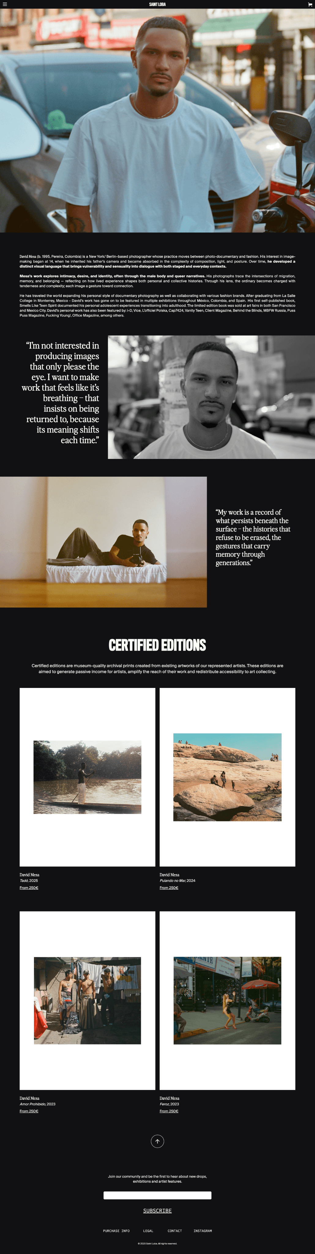
Saint Loba is a cultural platform representing artists of colour, selling certified art print editions through their e-commerce site.
The client came with a mission, a name, and visual references, but no visual identity, no website, and no content. My brief was to create everything from scratch and hand off a site the client could manage independently. The constraints were real: no content ready at the start, a client unfamiliar with responsive design, and a hero section planned around a video that didn't exist yet.
Brand Identity
Visual identity from scratch. Typography, colour, editorial direction.
Web Design
Minimal editorial design across all pages, homepage, artists, shop, about, contact
Webflow Build
Full implementation including CMS and Shopify API integration
Client Handoff
CMS structured so the client adds products and artists without touching the design
Minimal and editorial
across every page.
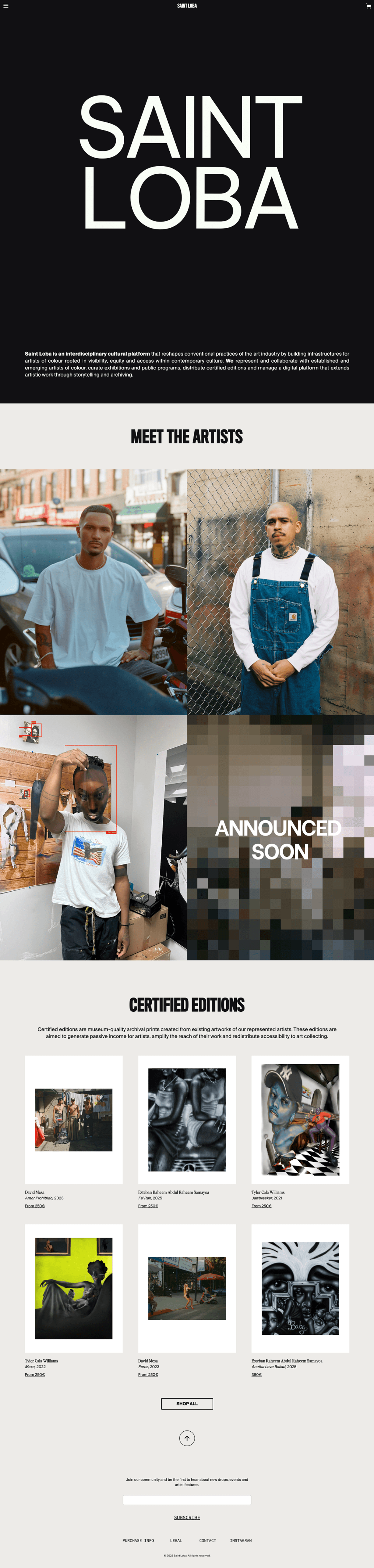
The visual direction was built around the work itself, art and photography that needed space and restraint, not a loud brand competing with it.

Simplifying without
losing the vision.
I pushed to launch without the hero video and the fourth artist.
The client wanted to wait for a homepage video and a fourth artist before going live. Both were months away with no confirmed delivery date. Waiting would have meant an indefinite delay. I designed a cursor-tracking hero using the Saint Loba heading as the interactive element, and an "Announced soon" placeholder for the fourth artist slot. The site launched on time. Both placeholders held the vision without exposing the gap.
I made scope decisions the client couldn't make themselves.
Client-side delays on content, micro-detail revisions, and requests for additional complexity threatened to push the project indefinitely. I prioritised getting a strong V1 live over adding complexity, and advocated for shipping and iterating over waiting and perfecting. The actual build took two weeks. Getting to launch took longer because I was managing content dependencies, not design ones.
I simplified the navigation to two states
The client wanted multiple different navigation bars. I pushed back and designed two — light and dark. Better for the user, and easier for the client to maintain in Webflow without risking inconsistency.
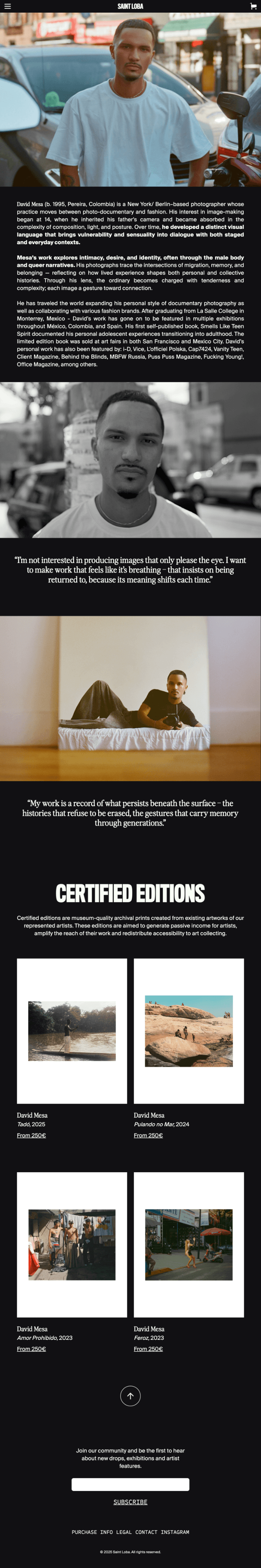
I designed per breakpoint, not per image
The client struggled to understand responsive design. Rather than fighting it, I designed specific image crops and layouts per breakpoint, some images visible on desktop and hidden on mobile, and vice versa.
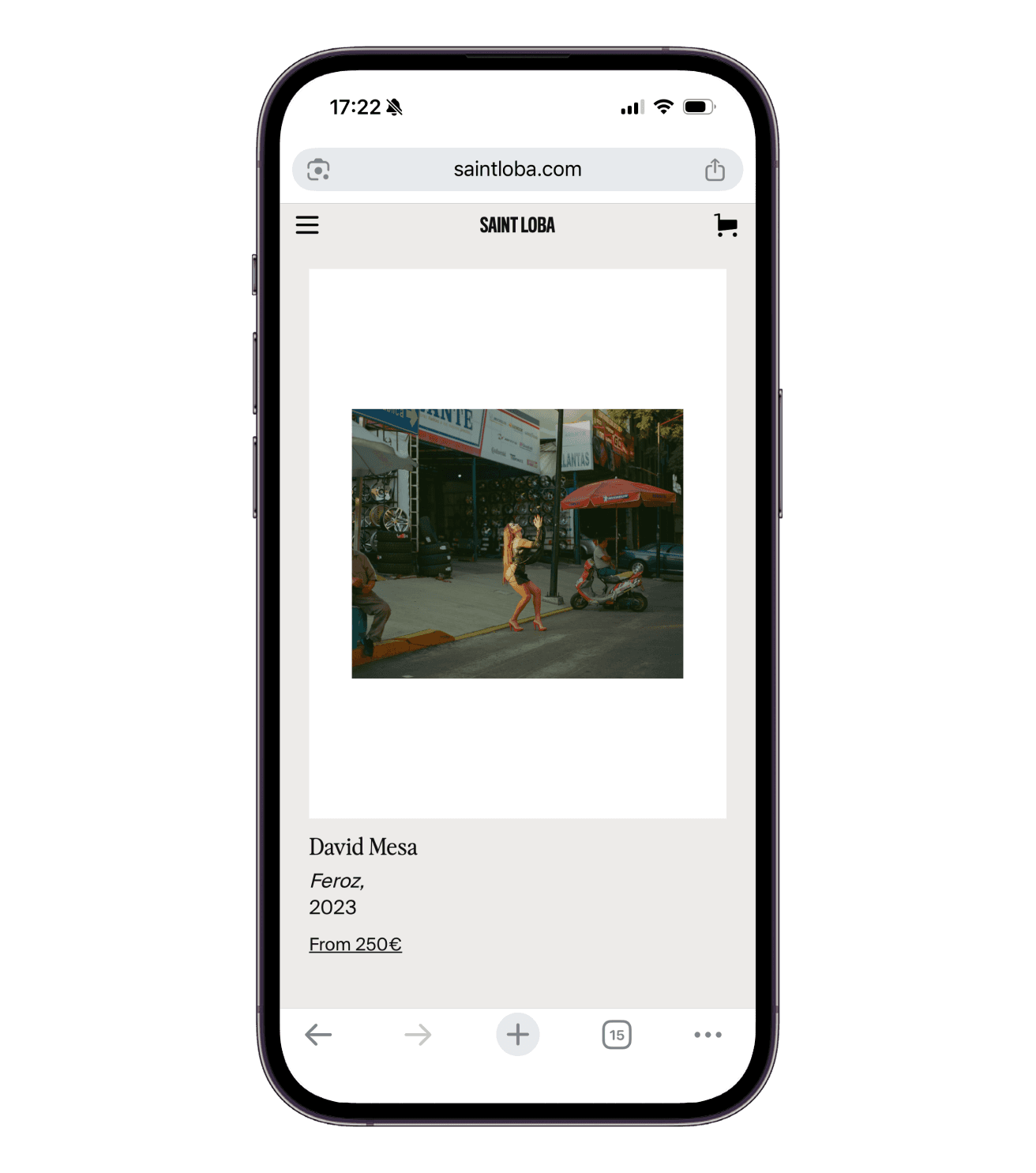
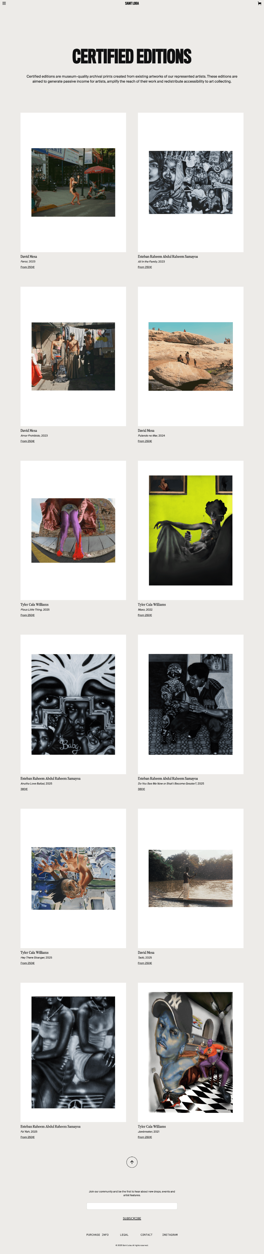
I standardised all product images before CMS upload
The prints come in variable sizes and orientations. Uploading as-is would have broken the shop grid. I defined a content guideline: all product images on a portrait white background, making the grid consistent regardless of artwork dimensions.
I built for independence, not dependency
I architected the CMS so the client can add new products and artists without touching the design or involving a developer. Connected Shopify via API. The goal was a handoff where the client never needed to come back for routine updates.
Every interaction
has a reason.
The interactions below weren't added for polish. Each one serves a specific purpose: reducing friction, communicating context, or making the platform feel considered without competing with the work it exists to showcase.
Cursor-tracking hero
SAINT LOBA heading moves toward the cursor
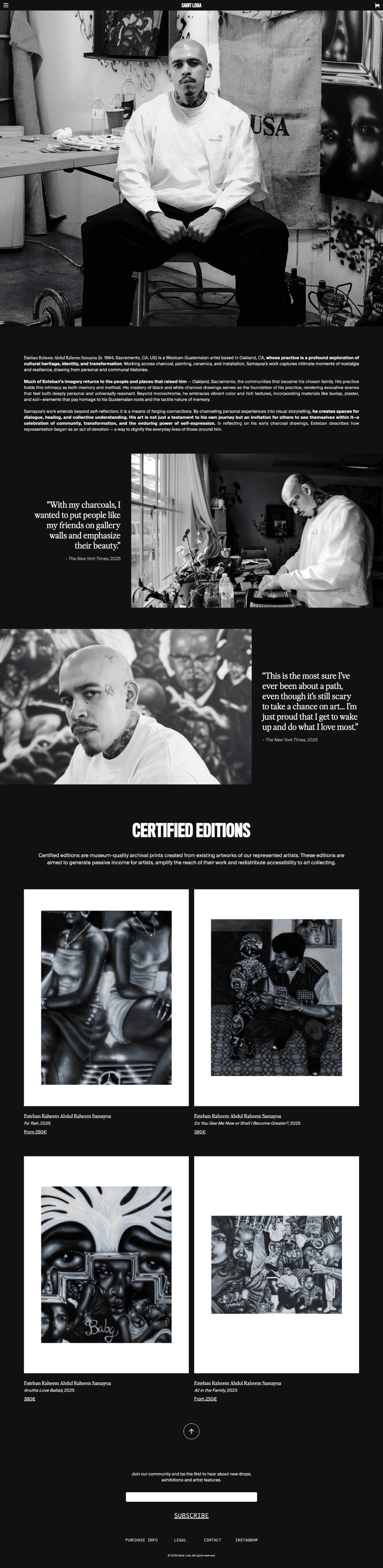
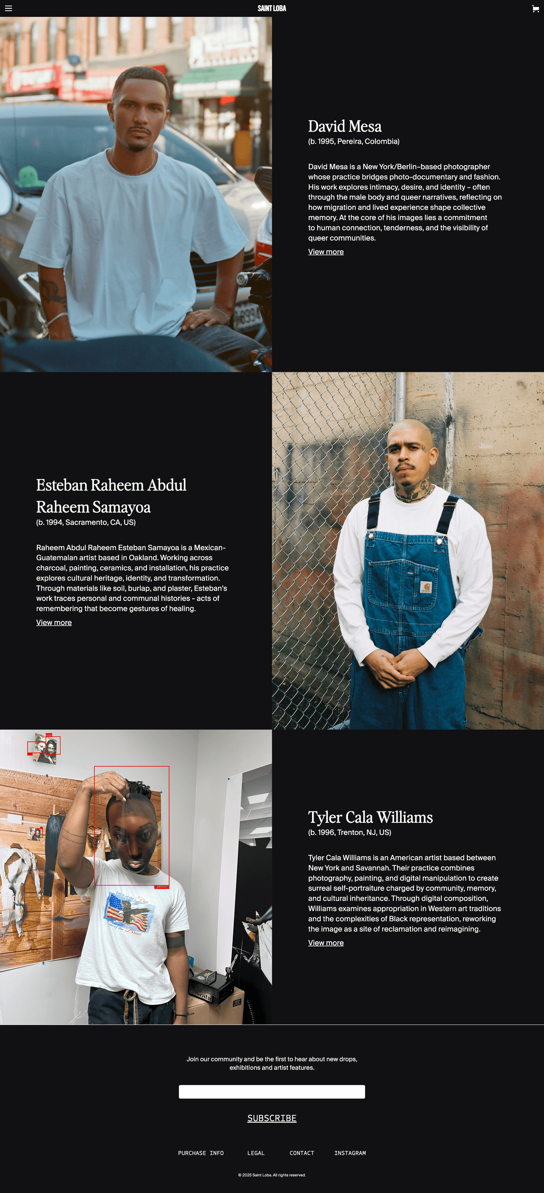
Artist card hover
Photography first, bio text revealed on hover
Dark / light navbar
Switches per page context automatically
Product accordion
Progressive disclosure on product detail page
Scroll to top
Persistent on long pages, shop, artist profiles
The brief was
delivered in full.
The site is live at saintloba.com. The client adds products, artists, and content independently without touching the design or involving a developer. The CMS architecture and Shopify API integration have held across updates since handoff. The grid stays perfect.
Across desktop,
tablet and mobile.

What this project taught me about
client work.
The biggest challenge wasn't the design. It was the process. The client had no content ready when we started, which meant designing with placeholders and adapting when real content arrived in different formats and ratios.
The client's focus on micro-details delayed the launch significantly. I shipped a considered set of V1 interactions and deliberately scoped more complex animations to a second iteration, prioritising getting the site live over adding complexity.
In retrospect I'd advocate more firmly for an iterative launch approach from the start, and define content deadlines as project dependencies rather than treating them as the client's problem to solve. The placeholder solutions worked, but they were reactive. A content-first kickoff would have made them unnecessary.